Color Woodcut Printmaking: Day 1
A friend suggested I take notes and write them up after each day of class to make sure things stick. Also, she wanted to know what I learned. This is my write up from the first day of Color Woodcut Printmaking with Karen Kunc.
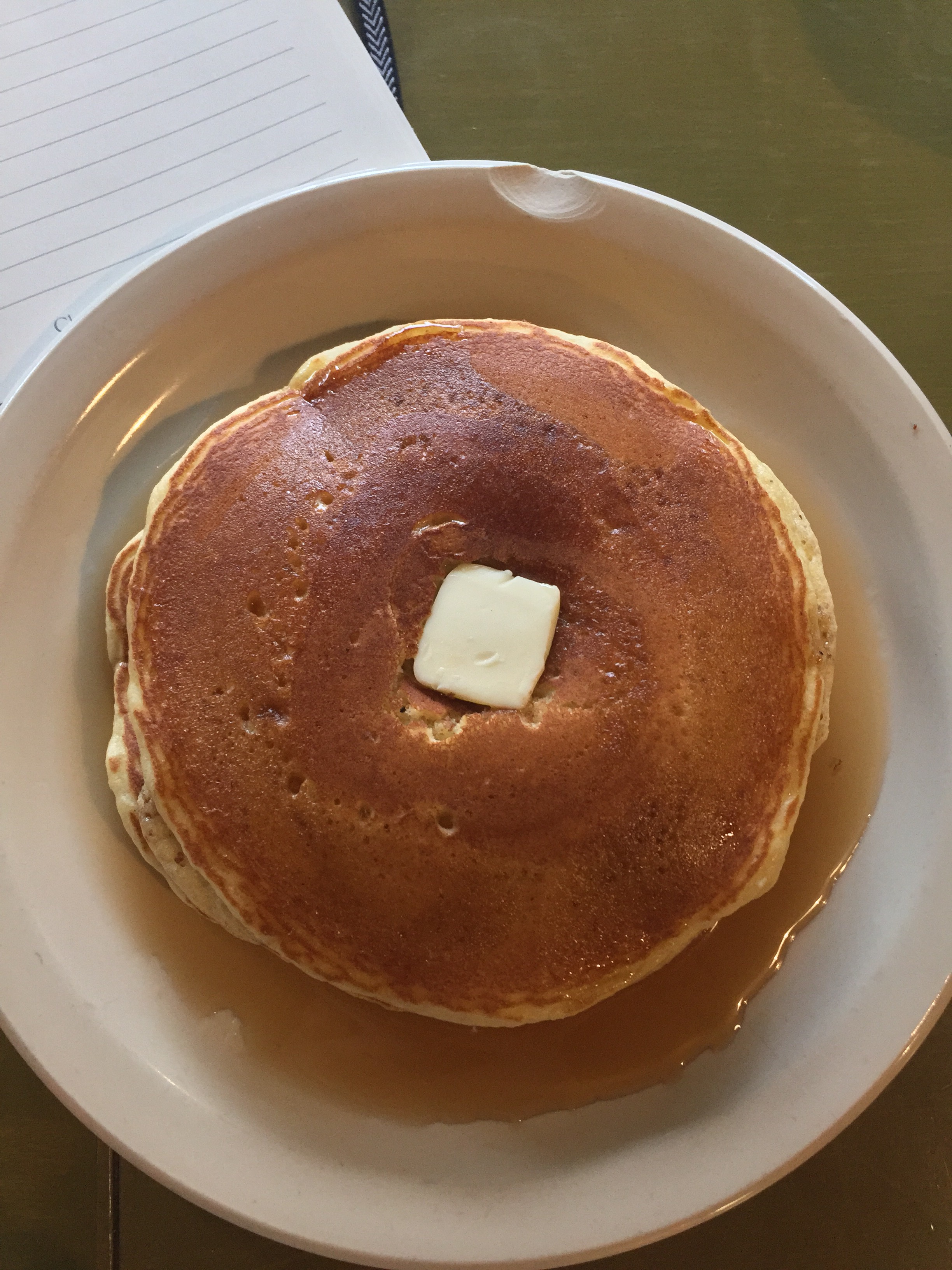
I started my day off with some journaling and reflection, as well as sustenance. I had done a little research on the coffee scene in Lincoln, and Cultiva had caught my eye. I drove there expecting a great cup of coffee and a crepe (since that’s what Yelp recommended), but when I saw Johnnycakes on the menu, I knew how I was starting my day. At this point I was still feeling pretty apprehensive about class. My friend Pat identified that feeling as the “who do you think you are?” feeling. So I wrote it down, and tried to set it aside.
When I got to Constellation Studios the place was already buzzing and the rain was starting to gently fall. Karen welcomed us and had us introduce ourselves. The class is about ten people, and pretty varied in age, background, and interest; from a retired pulmonologist who began printing as a way to explore his photography to a woman about to retire who hasn’t printed since her undergraduate work. A couple of people had taken classes with Karen before — repeat offenders are always a good sign — and most of us signed up at least in part because we’ve admired her work from afar for a while.
We spent most of the morning listening to a lecture and demonstrations from Karen. This was fascinating, and I have a list of artists to research and explore:
- Albrecht Durer
- Kathe Kollmitz
- Richard Mock
- Thom Shaw
- Zarina Hashmi
- Ernst Ludwig Kirchner
- Richard Berman
- A semi Uchima
- Jim Lee
- Kathy Puzey
- Amira Kurosaki
- Fritz Eichenberg
- Eman Ezat
- Wayne Crothers
- Robin Loebs
After the lecture Karen introduced us to our projects and started demonstrating the first one. Going into the class I wasn’t sure what to expect, whether it’d be multiplate color, reduction, or something entirely different. I expected multiplate, because I couldn’t figure out how she got the effects she did otherwise. Turns out it’s reduction, but not “normal” reduction. Karen uses a combination of reduction and masking (she calls them stencils) to exponentially expand the ways the color combines. Throughout the class we’re going to be doing two projects: one single block reduction, and one two block reduction, the latter exploring positive and negative in addition to everything else going on.
The prints we’re making in this workshop are “bleed prints”, meaning that the ink and image runs off the edge of the paper. To accomplish this, the blocks we’re using as 12″ x 16″, and the paper is torn down to about 11″ x 15″.
The general process is something like:
- Draw the paper and the image on the block; include at least one registration mark along each side, and mark two of them with a cross bar to prevent paper rotation.
- Apply a thin layer of shellac to the block and allow to dry.
- Lightly sand with very fine sand paper.
- Carve things into the block you want to remain the underlying color (either the paper or the color you just printed)
- Create a mask for inking
- Ink and print
- Repeat 4 through 6 until complete.
The blocks we’re using are 1/4″ birch veneer plywood; when asked “why not shina?” Karen replied, because “it keeps the perfectionistic instinct in check.”
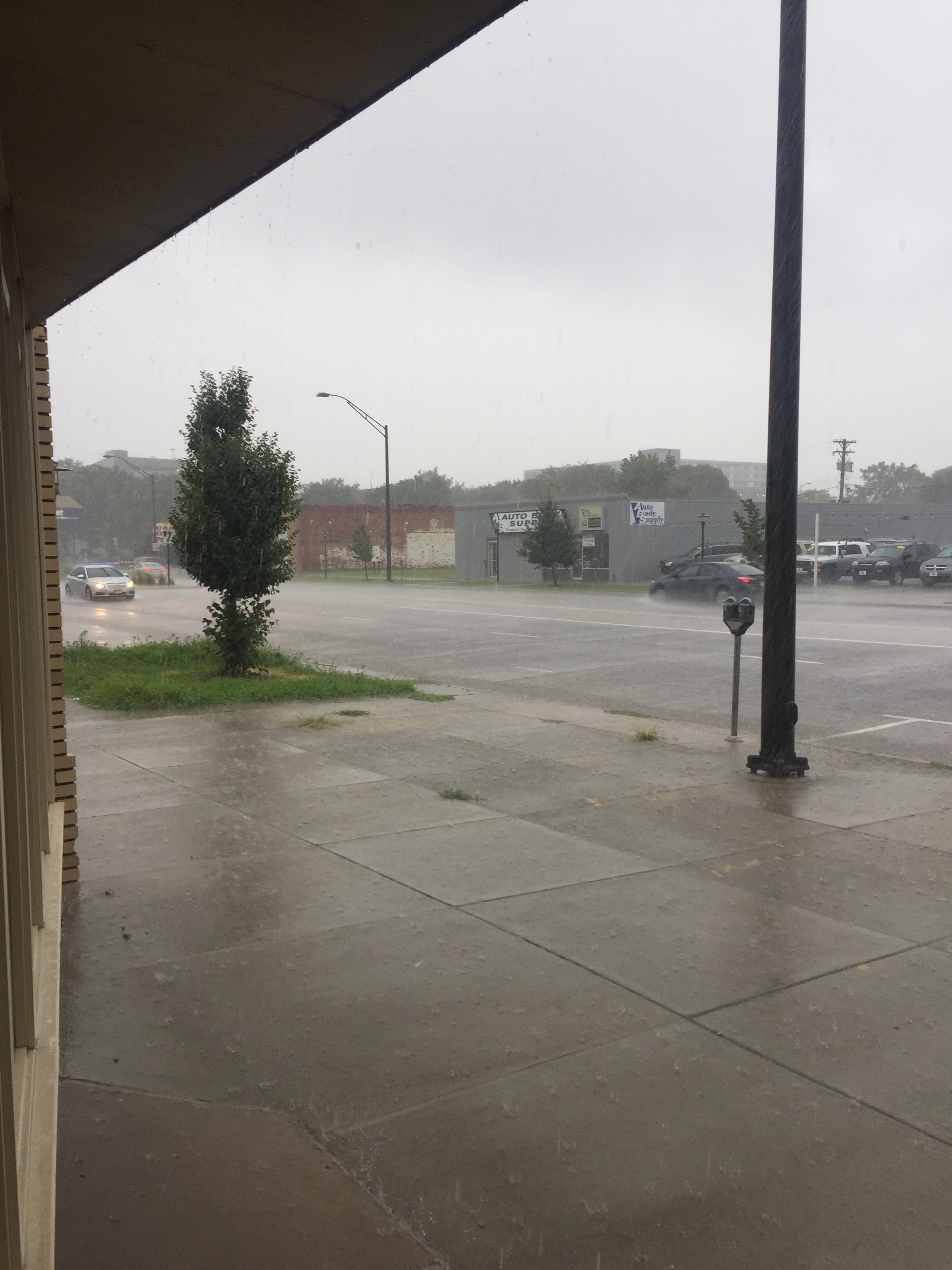
I went to lunch with a classmate at The Hub and came back for the first inking demonstration and to get to work. I also got the thunderstorm I was hoping for.
Just like the reduction technique, Karen’s guidelines on inking bear little resemblance to my past work. She lays down very thin layers of very transparent color (in this respect I thought of Jenny Robinson’s approach to monotype), and doesn’t thin the inks using burnt plate oil, preferring ink modifier (tack reducer) to make them workable. I asked about thinning with burnt plate oil and she said she doesn’t recommend it because the oil can separate from the ink and blossom into an oily ring around the color. I haven’t seen that happen in the past, but that may be because of the type of ink I was using (etching ink vs lithography ink) or the type of paper I’ve been printing on (cotton vs. kuzo).
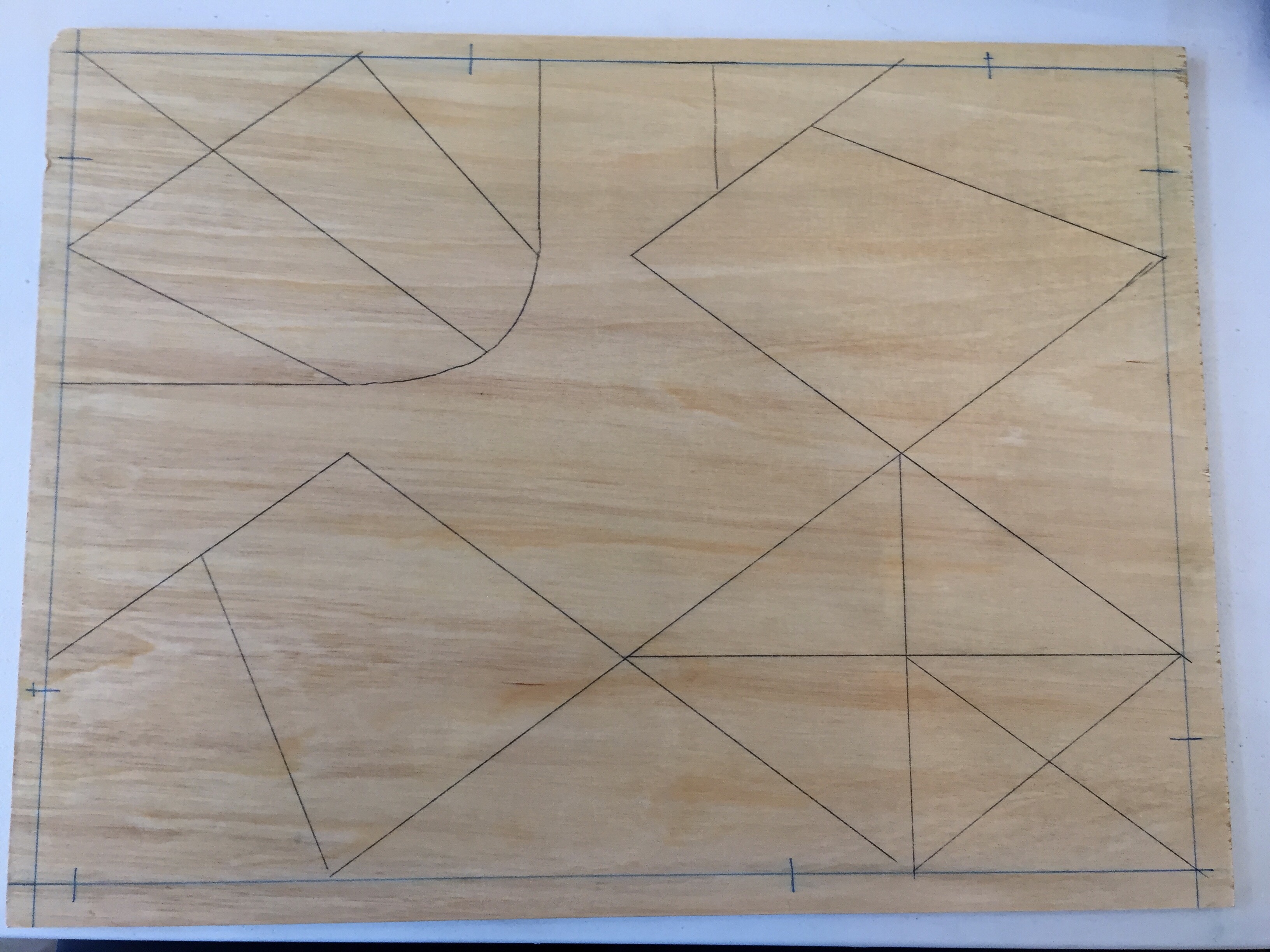
After the inking demonstration she set us loose to begin work on our print. I still don’t have enough experience with this technique to be able to predict the results so I decided to stick with something abstract. I began with an origami crease pattern from a piece by Rob Snyder and modified it, stretching it to fit the block and mutating some of the lines. In the end my block looked something like this.
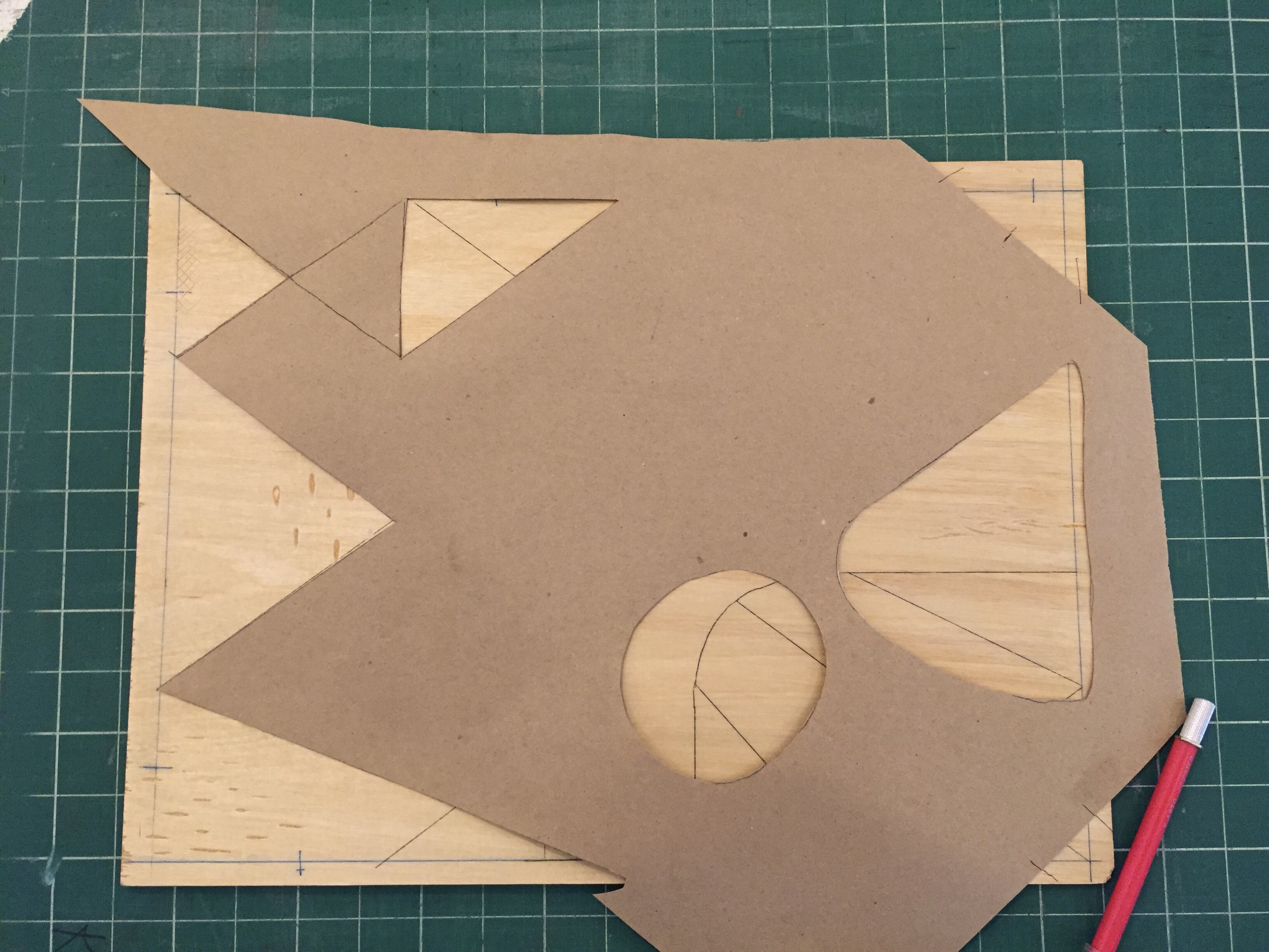
I made some marks on the block — things that would be white — and then cut my first template. One of the things Karen suggested for carving is to keep the wood you want to save “behind” the blade to avoid splintering and losing some detail you’re interested in. This makes sense once you make a few marks and see how the plywood splinters and cuts; the linocut equivalent is probably “carve away from the lines you want to keep”.
The mask is cut from brown kraft paper, and has its own registration marks drawn in two corners so it can be applied consistently. The most interesting thing to me is that the shapes cut in the mask don’t necessarily correspond to the shapes you’ve drawn on the block. So you have another vector for adding shape and building up the image.
I unfortunately didn’t get a photo of inking through the mask, but here you can see the block with the ink applied. Karen uses her fingers or the heel of her hand to blend the edges of inked areas, such as the blue one in my piece. The result is that you can have areas of color with hard or soft edges.
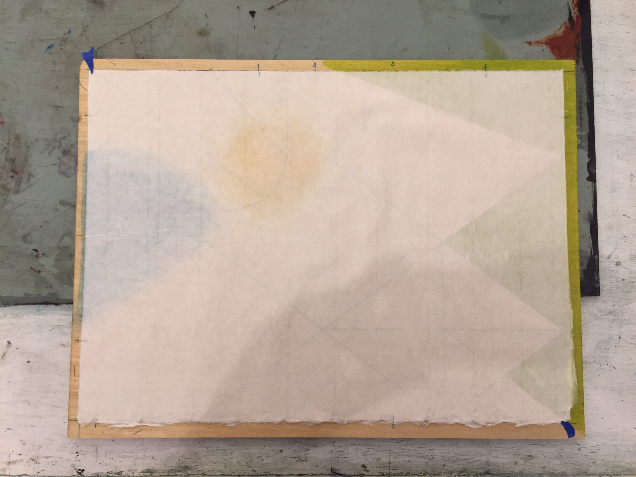
After inking the paper is placed on the block and lightly tacked in place with blue painter’s tape. Note the registration marks along the edges of the block and paper; two of them are crossed on both sides, which ensures that the paper isn’t rotated. I think the thing that makes this registration technique so straightforward is that you’re registering the paper onto the block, rather than trying to register the block and paper onto the press bed. One less thing to move makes it much, much easier.
Another change from my past experience is that we’re printing on an etching press without blankets. When I asked Karen about this, she pointed out that the blankets are what push the paper into the carved away area. This gives you embossment (which you might want, but she does not), but also means that you’re continually fighting to make sure the carved away areas don’t print. In addition, with large sheets of kuzo paper, the blankets can cause the paper to move. It’s clear to me that every press owner decides for themselves what a press “needs” for printing, but the lack of blankets did make the process much quicker, which I suspect will be good tomorrow when everyone is printing.
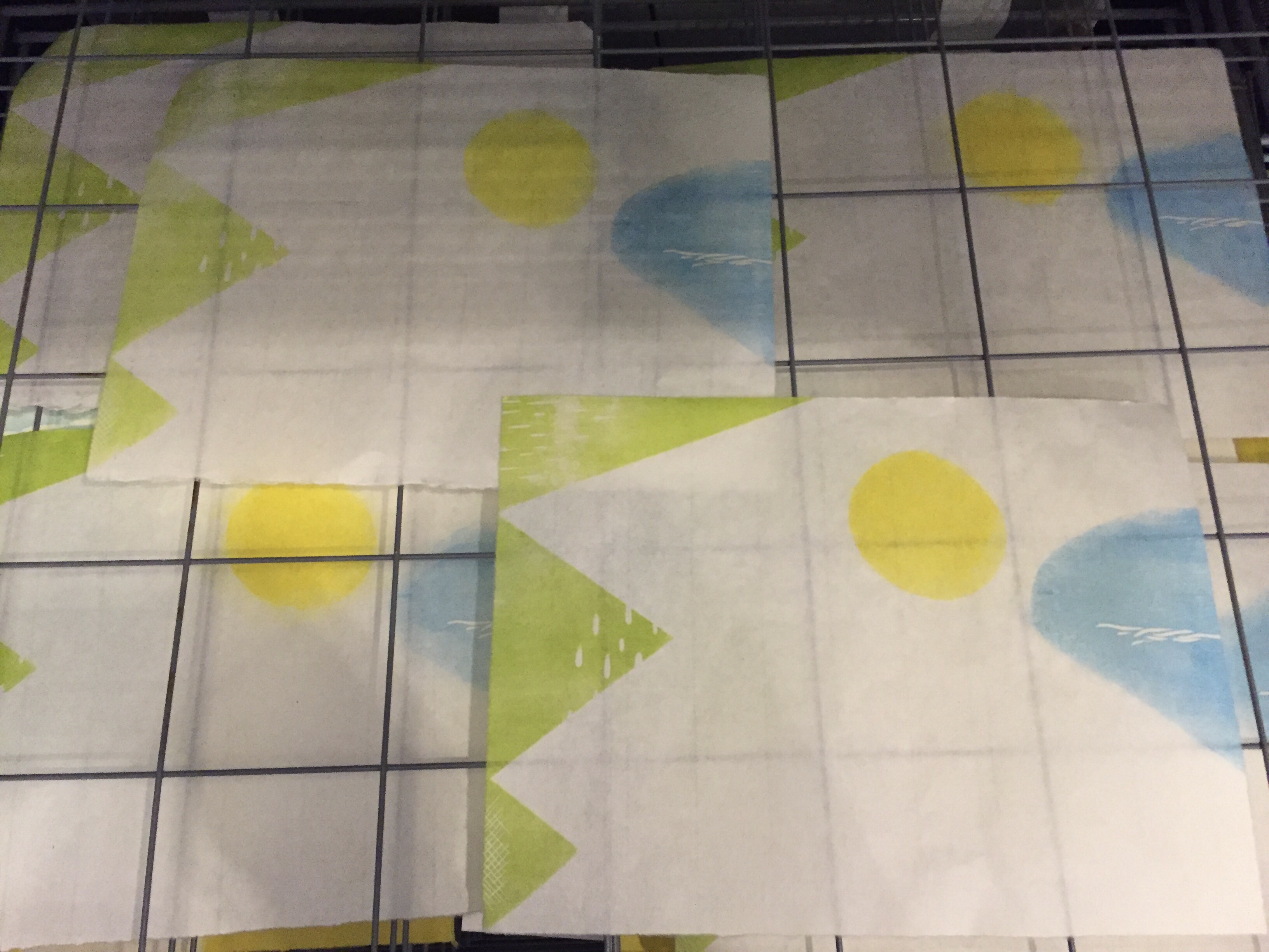
At the end of the day I had my edition of six (plus a ghost for a monoprint) and had started carving away areas in the green area that I want to remain green.
I still don’t feel like I can predict what this print is going to look like, and I’m trying to let go and accept that. Maybe it’s working (a little), because I’m excited to go back tomorrow morning.