Color Woodcut Printmaking: Day 2
I’m blogging about my experience taking Karen Kunc’s “Color Woodcut Printmaking” class at Constellation Studios.
Today was a work day in the workshop: the only demonstration to the entire class was this morning, when Karen demonstrated laying down the second pass of color on her sample print. Otherwise it was nine hours of carving and printing. Right now I’m feeling great about the class and about the work I’m doing. Towards the end of the day Jim asked me how I was feeling about the day’s work. “Well,” I replied, “I’ve made it through the trough of despair, so I’m feeling pretty good.”
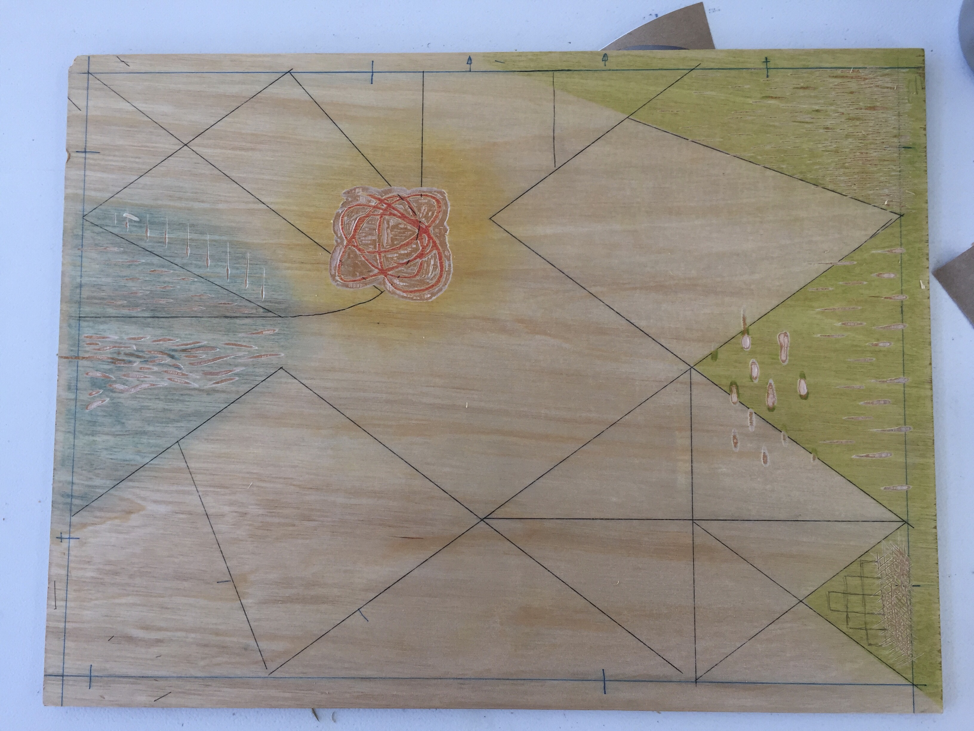
I came into the day with a single drop of color down, ready to start the second. Karen suggested we aim for (at least) four passes for this project, and when the day started I thought, “OK, that means I have about two hours for each pass, and then I can start on the next project.” I failed to account for “at least”. Compared to some of the other workshop participants, my first pass contained relatively little color. I realized looking around that you can only see something if you print color over it. That is, I made some marks in the block that showed the paper color through, but only when I printed them. There were other marks I made before printing that didn’t have any color applied to them, so they were just hanging out with nothing to do until I got around to placing color there. And after the first pass this becomes even more important: if I wanted the yellow or green I printed yesterday to show up in the final print, I had to either carve away before I printed over it, or, well, not print over it.
And that leads to the second thing I realized today: flat color is flat. It doesn’t have any energy or movement unless it’s vibrating up against something, or has something layered over it. Working with linocut, I think of color as something that you apply after you’ve made your marks and created the image. With reduction, color is the mark that helps create the image.
So I did some more carving and printed my second pass.
This is the first point where I felt like there was something in the print to respond to: the star-like shape in the middle, revealed as negative space. So I made another mask and printed over that.
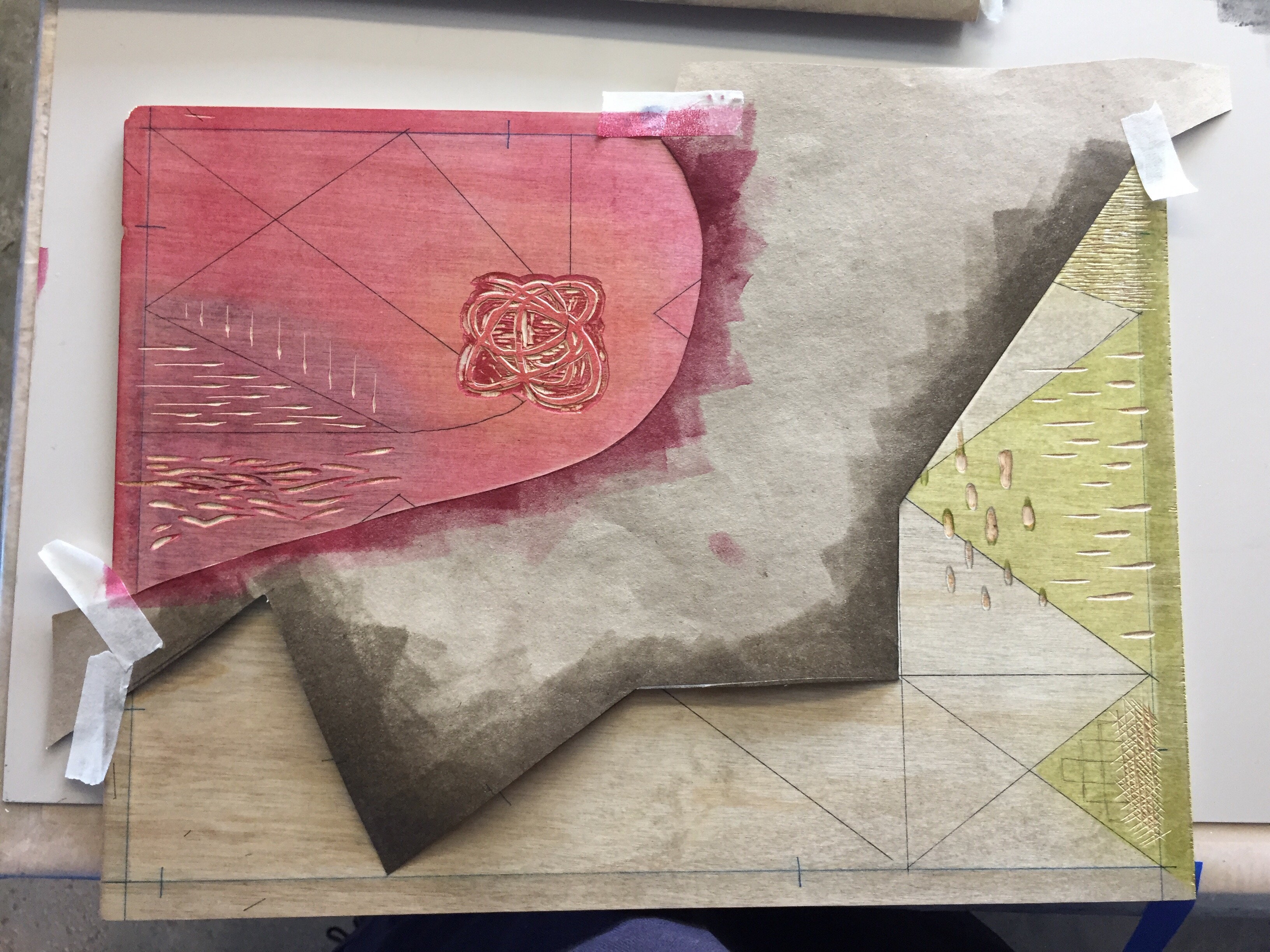
But after my third pass I was in the trough of despair: that third pass didn’t do much for me, it was just flat color. And I felt a little stuck trying to figure out just what the fuck I was trying to carve (express).
Three passes in and the piece felt pretty flat and lifeless. I asked Karen for advice, and she pointed out there were large swaths that hadn’t been carved yet; they only had that flat color (which is flat). “Sometimes I get to the point where the only thing to do is attack the wood,” she said. So I did.
I started carving more aggressively and deviating from my original idea more. I started responding to what was already there instead of trying to hold quite so much control. By the end of the day I printed my fifth pass and am ready to print my sixth tomorrow morning. That may be the last, or maybe not. We’ll see.
Miscellaneous notes from the day:
It’s really important to work lightest to darkest; having a palette that’s “mine” would make it easier to understand what that sequence might be.
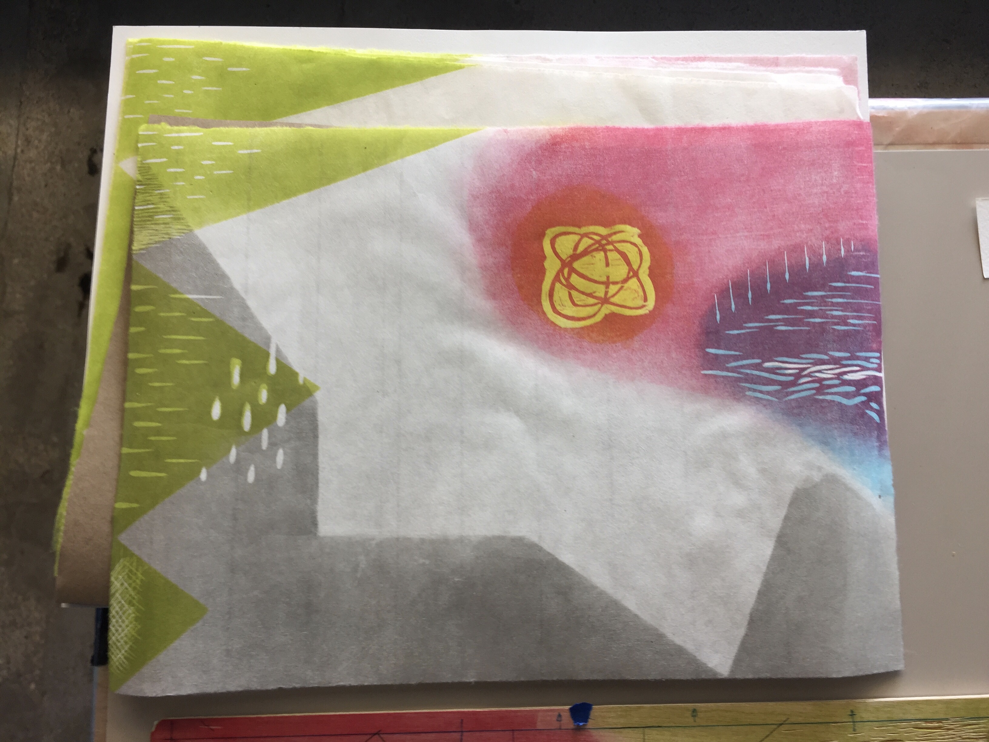
I’m batting about 0.500 for perfect registration. The system Karen uses seems pretty reliable; the prints where I haven’t had perfect registration are ones where the registration marks are either half there or obviously inaccurate.
Getting perfect registration on a reduction looks pretty amazing.
Cohesion is important in abstract pieces; at one point Karen pointed out that I hadn’t continued the “cheese grater” marks after the first pass, so they sort of stood out on their own. That’s something I was able to fix.